
Evolving an unused app into an efficient mobile solution, turning paper-based field work into a practical digital workflow_
Adding new features and redesign the navigation and interfaces of the mobile applications for technicians, streamlining their fieldwork
Lead UX/UI Designer for all the company’s design needs across mobile, desktop, and other tools. Worked directly with the company director and developer to define design direction and make key decisions, ensuring alignment with user needs and business goals.
What I had to work with
Live Product
The product was already live, meaning any change had to be carefully considered to avoid disrupting existing users and workflows.
Multi-Tool Ecosystem
The mobile app was part of a larger suite of tools, connected to a desktop application used by different user profiles but sharing the same ecosystem.
Limited User Access
Direct access to end users was limited, restricting the amount of primary research that could be conducted.
My process
Every project follows the same three phases. Open a step to see what it produced.
How I worked
Prioritizing improvements in a live product
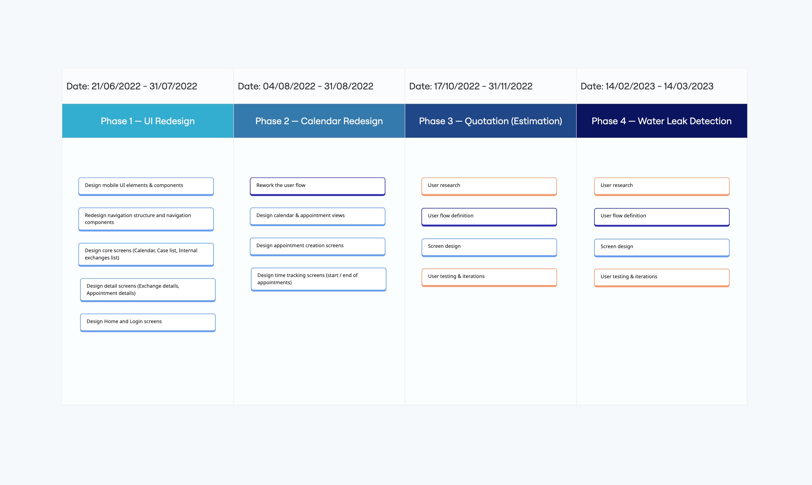
To work safely within a live product and limited development capacity, I defined a phased redesign strategy based on urgency and impact, focusing first on the areas that would most improve the user experience.
This approach delivered incremental value without risking the stability of the product, while remaining realistic given technical and resource constraints.
Ensuring consistency across a multi-tool ecosystem
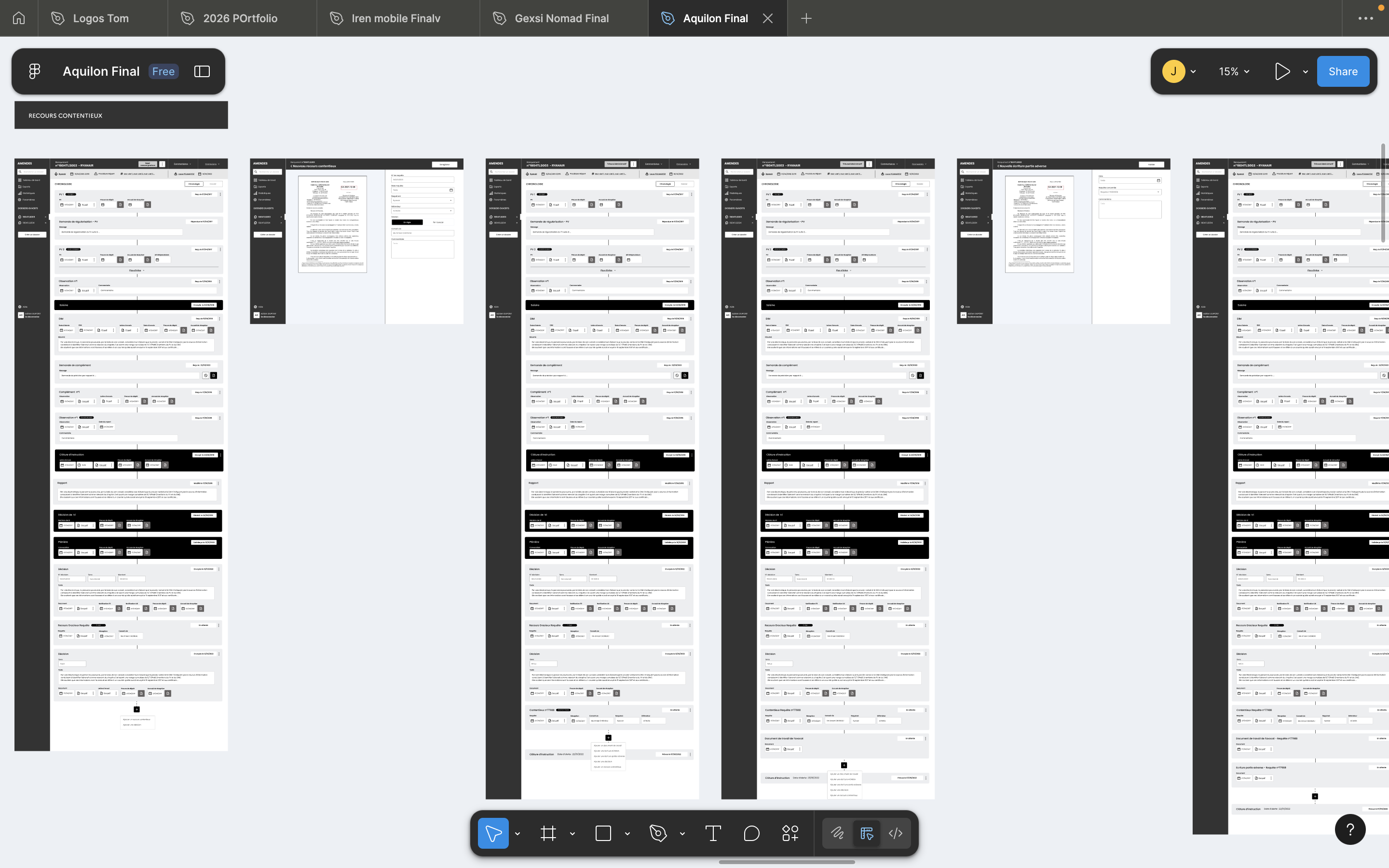
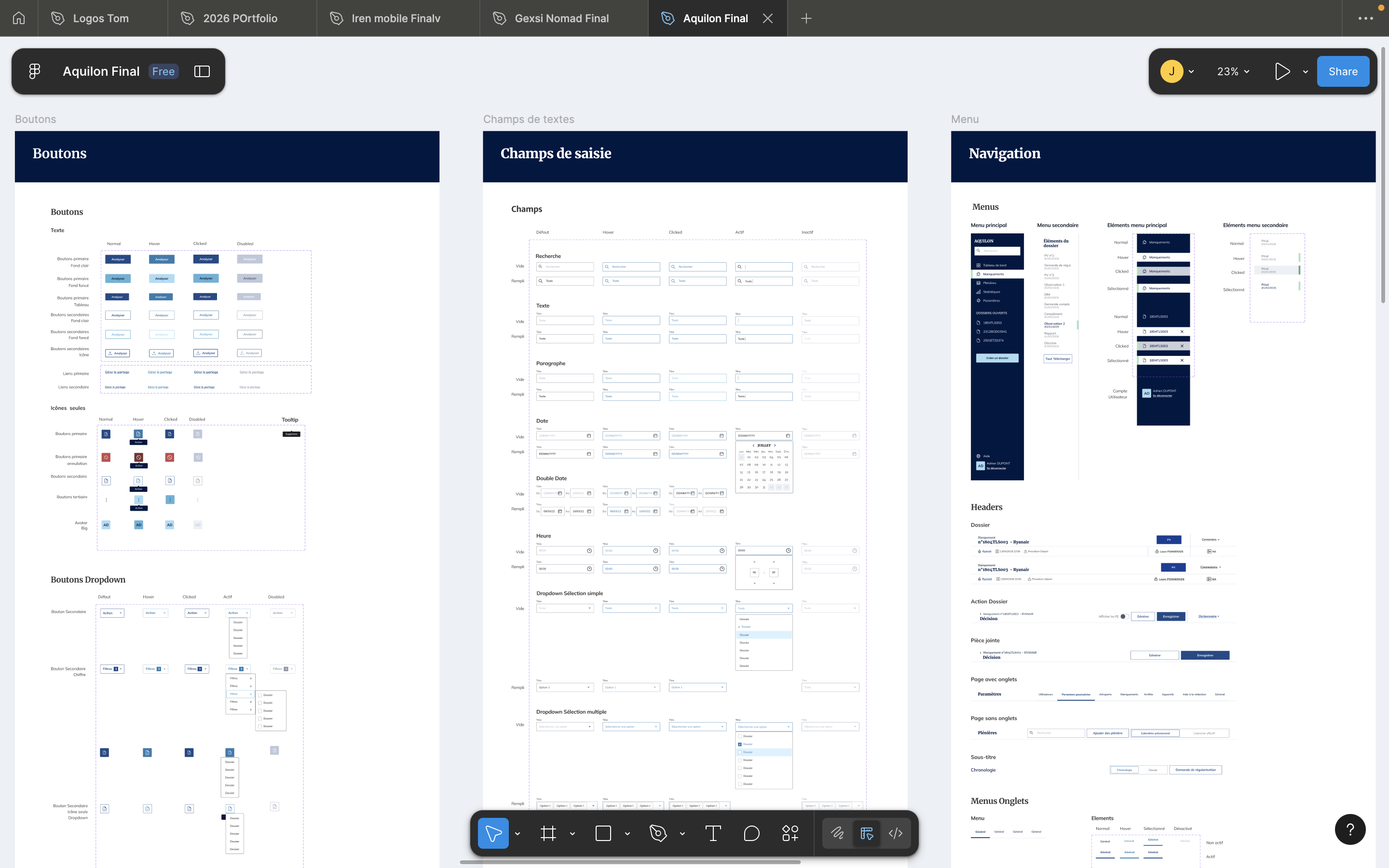
I reused existing patterns, technical constraints, and user habits from the current mobile and desktop tools, and leveraged the desktop design system I was building by adapting it into mobile-friendly components.
This ensured visual and functional consistency across the suite, reduced friction for existing users, and minimized development effort.
Adapting research methods to limited user access
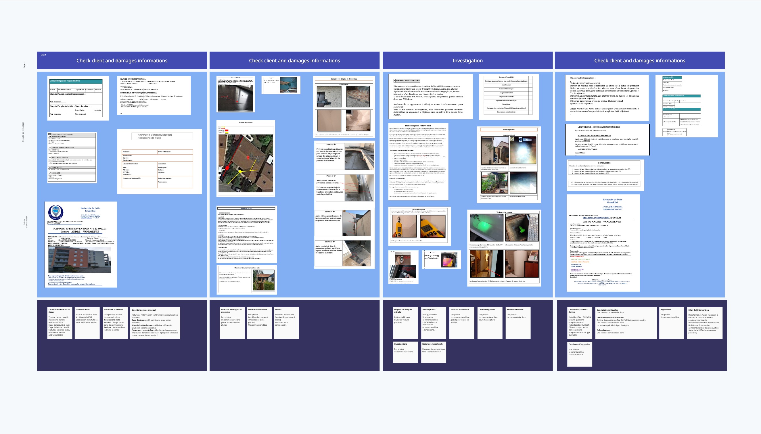
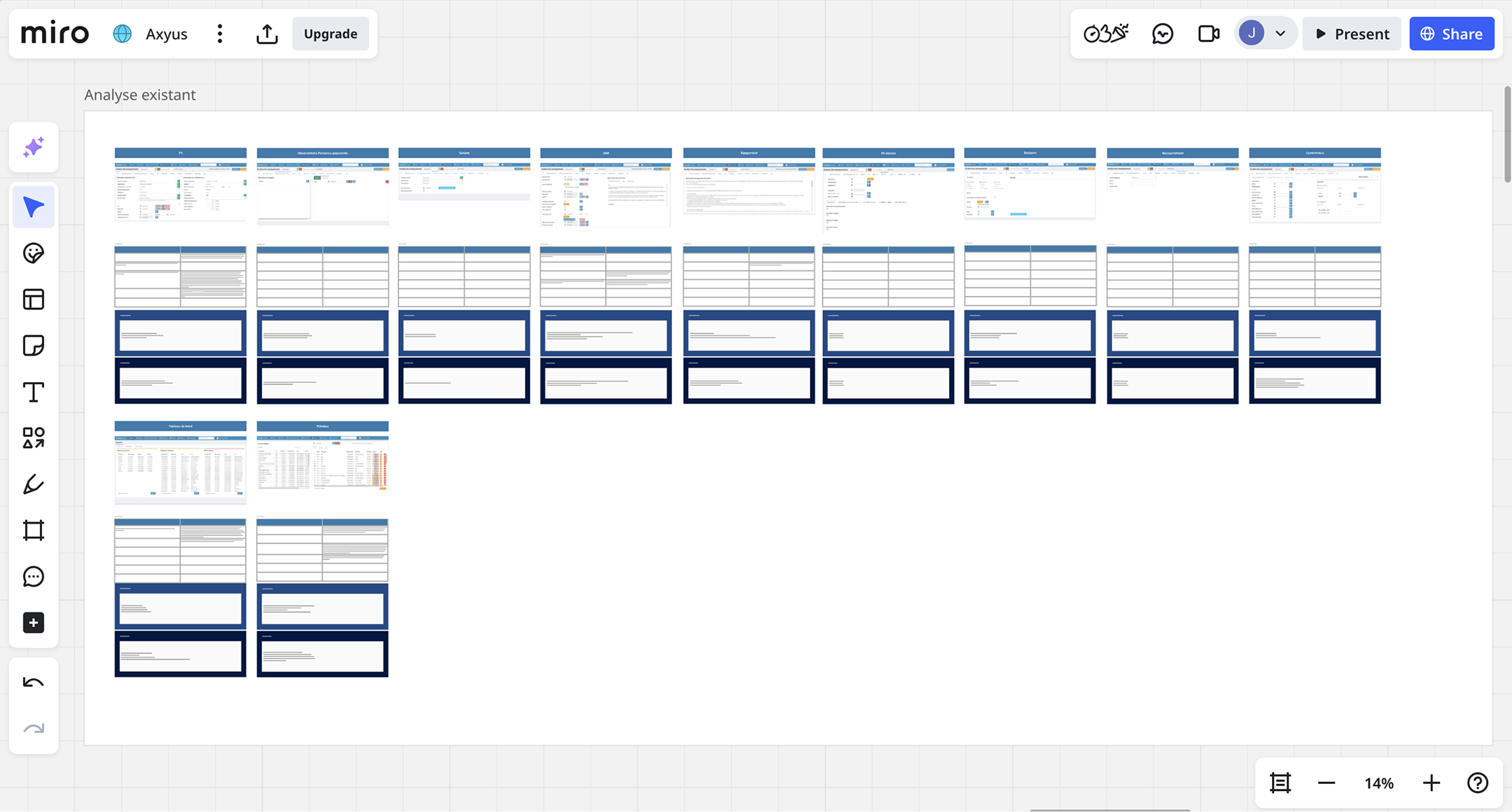
With limited direct access to users, I combined interviews with close collaboration with the support team, analysis of user reports and workflows, review of desktop app usage, and usability testing with construction professionals in my personal network.
This allowed me to make informed design decisions grounded in real-world usage, despite research constraints.
What I did
Navigation
Users struggled to orient themselves on mobile: They had to switch between multiple tools And, once inside a file, navigate multiple layers of content. This created cognitive overload and slowed down task completion.
I separated navigation into two clear levels, aligned with user intent: Global navigation to move between tools & Contextual navigation to work inside a file. This reduces mental load and clarifies “where am I vs what am I doing”.
History built block by block
Cases build their history block by block as actions are taken
Automatic next steps and deadlines
Core process stages automatically reveal next steps and deadlines
Manual additions as cases evolve
Additional documents, communications, or materials can be added manually as the case evolves
Schedule
The existing schedule Was visually dense on mobile, Made information hard to scan, Didn’t support key actions (create, start, end meetings).This forced users to leave the agenda to complete simple tasks.
I redesigned the schedule as an action-oriented tool, not just a calendar: Prioritize readability on mobile / Differentiate personal vs team agendas / Embed key actions directly into the flow
Agenda built for scanning
A simplified mobile agenda view, optimized for scanning
Personal and team filters
Filters to switch between personal and team schedules
Quote / Report flow
Technicians needed to create quotes directly on mobile:Fast, because it’s done on-site & Detailed, because it feeds pricing, materials, and reports
I structured the quote flow around how technicians think on-site: Separate general information from room-specific information / Allow progressive detail without forcing users through the same steps repeatedly The goal was speed first, without sacrificing precision.
Plenary scheduling
Users can set provisional and confirmed schedules directly in the platform
Request tracking
Reports, modification requests, and requests for additional elements are automatically transmitted and stored in case history
Custom statistics
Users build tailored reports by selecting their own data parameters and timeframes
From time-consuming work to Streamlined task
Repetitive tasks could be automated or simplified
Streamlined common actions and added document templates with pre-written sections for recurring reports
Smart file upload
Users can enter all related data while previewing the file side by side
Automatic deadline handling
Mandatory steps are processed automatically when deadlines pass
Document templates
Writing assistance with pre-written templates and paragraph sections for recurring reports
From unclear task priorities to Dashboard by actions
Users couldn't easily see what tasks they needed to do for their role
Organized cases by what needs to be done, with each tab matching specific user roles so users can immediately see their relevant tasks.
Tabs matched to user roles
Organized cases by what needs to be done, with each tab matching specific user roles so users can immediately see their relevant tasks.
The impact I made
increase in mobile license purchases
new major clients acquired
gain in field reporting productivity