


Designing clarity and collaboration into complex, regulated case management_
Design a fine management tool for the Airport Nuisance Control Authority, streamlining complex multi-stakeholder workflows and reducing case processing inefficiencies.
Senior UX/UI Designer, design lead on the project, responsible for driving the design from discovery to development handoff in close collaboration with Product, Tech, and end users.
What I had to work with
Regulated Workflow
Users operated within a workflow governed by strict legislative requirements and fixed procedural steps, supported by long, document-heavy case files requiring careful management.
Tight Timeline
The project timeline was limited, constraining the scope of design work that could be realistically explored and validated.
Feature-Driven Brief
Initial specifications were highly detailed and feature-driven, with little focus on user journeys, needs, or the rationale behind requested functionalities.
My process
How I worked
Reframing the product around real user needs
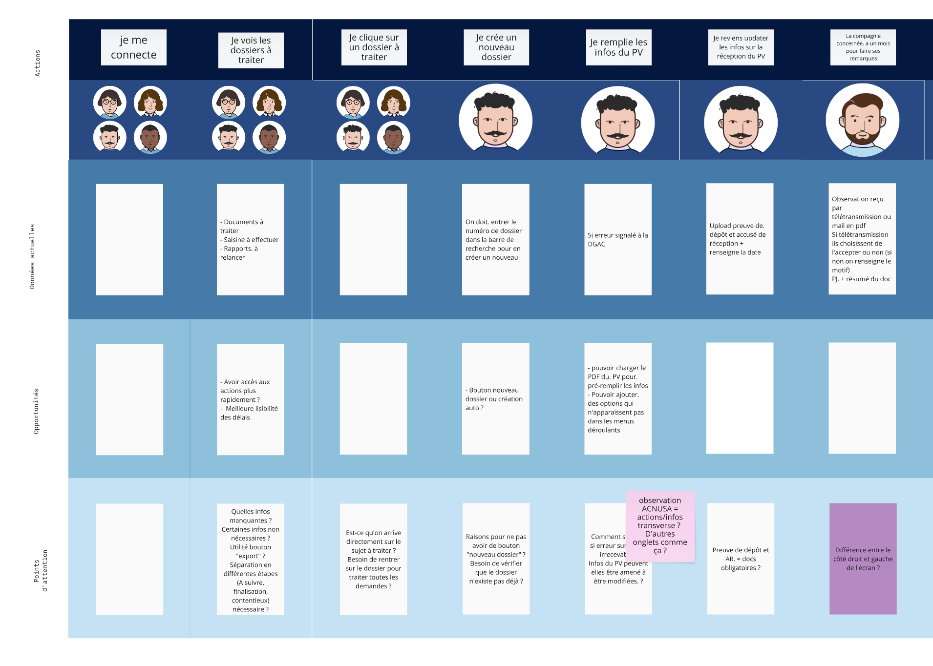
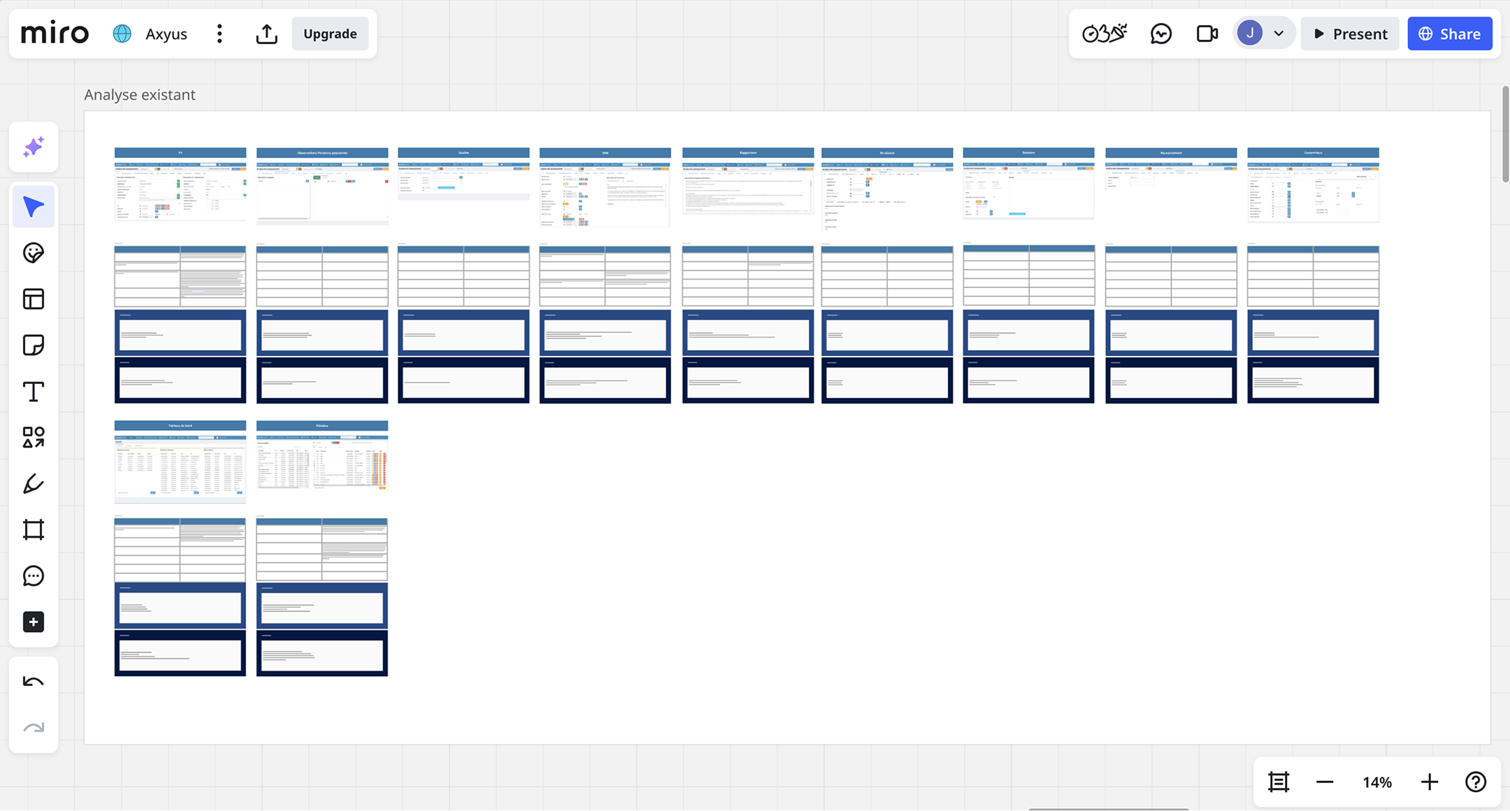
Through interviews and observations, I challenged the initial brief when it became clear that adding features alone would not improve the experience, and instead rethought how the system should work to better support users.
The final solution was more coherent, simpler to use, and better aligned with actual user needs rather than predefined requirements.
Improving efficiency within a fixed, regulated process
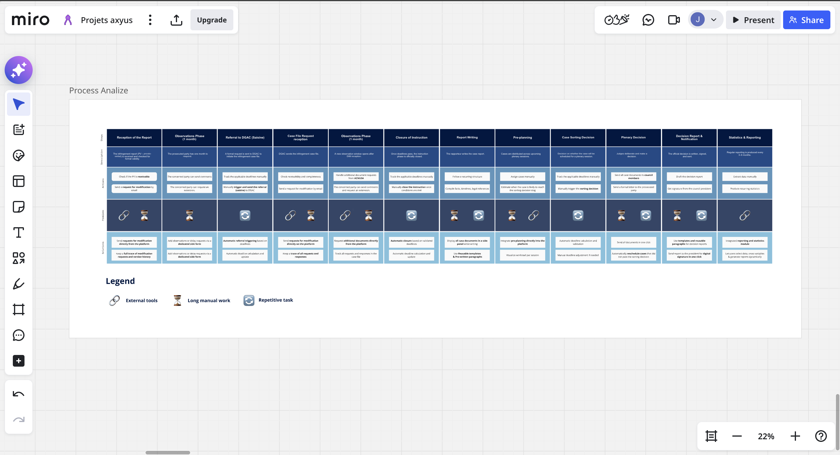
Beyond designing user flows, I analyzed the underlying working process in detail to identify where efficiency could be improved, such as automating repetitive actions, clarifying steps requiring manual validation, and integrating external tools already used by operators.
This helped streamline daily work without changing the regulated process itself, reducing friction and making complex operations easier to manage.
Designing for clarity and scalability under time constraints
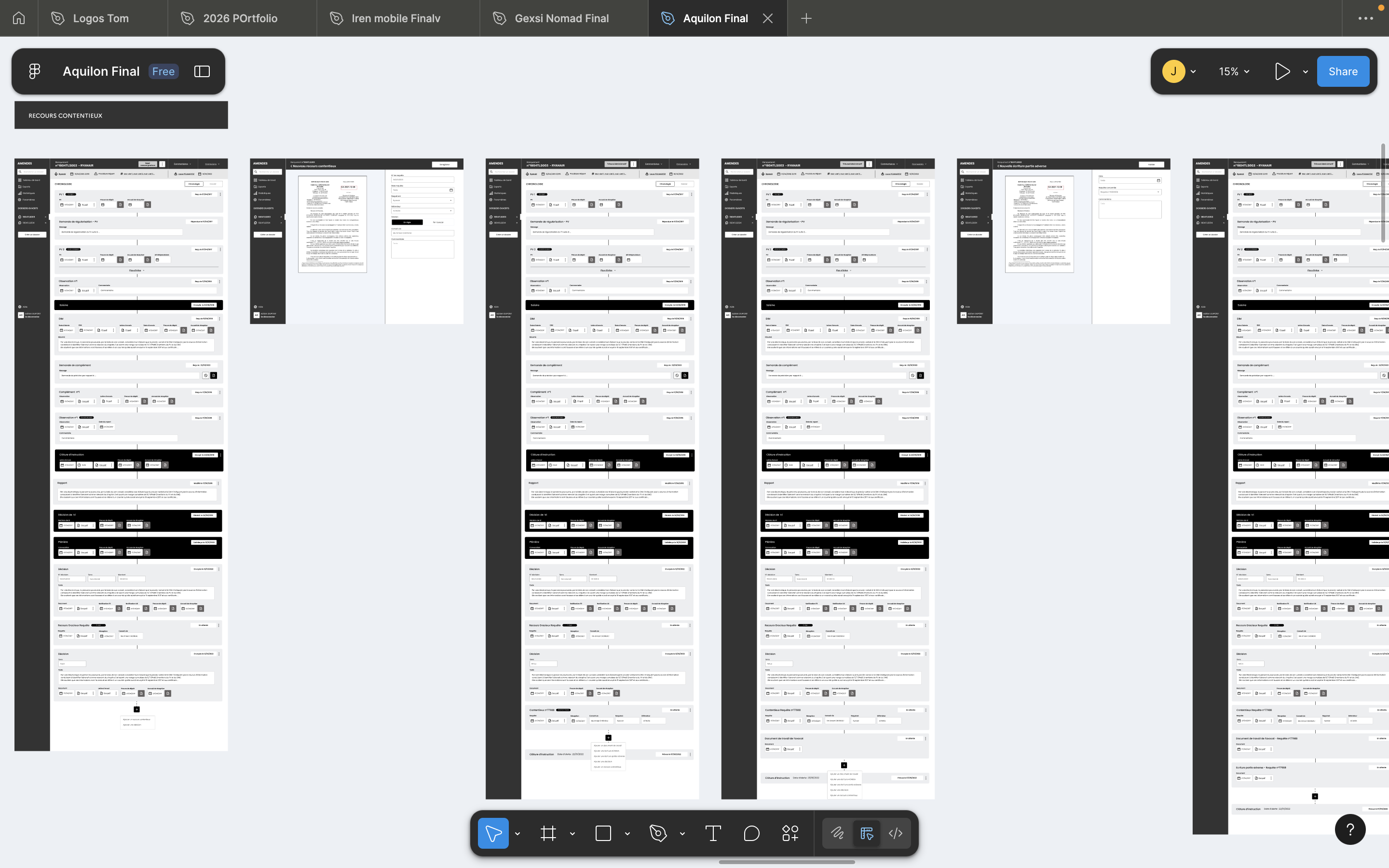
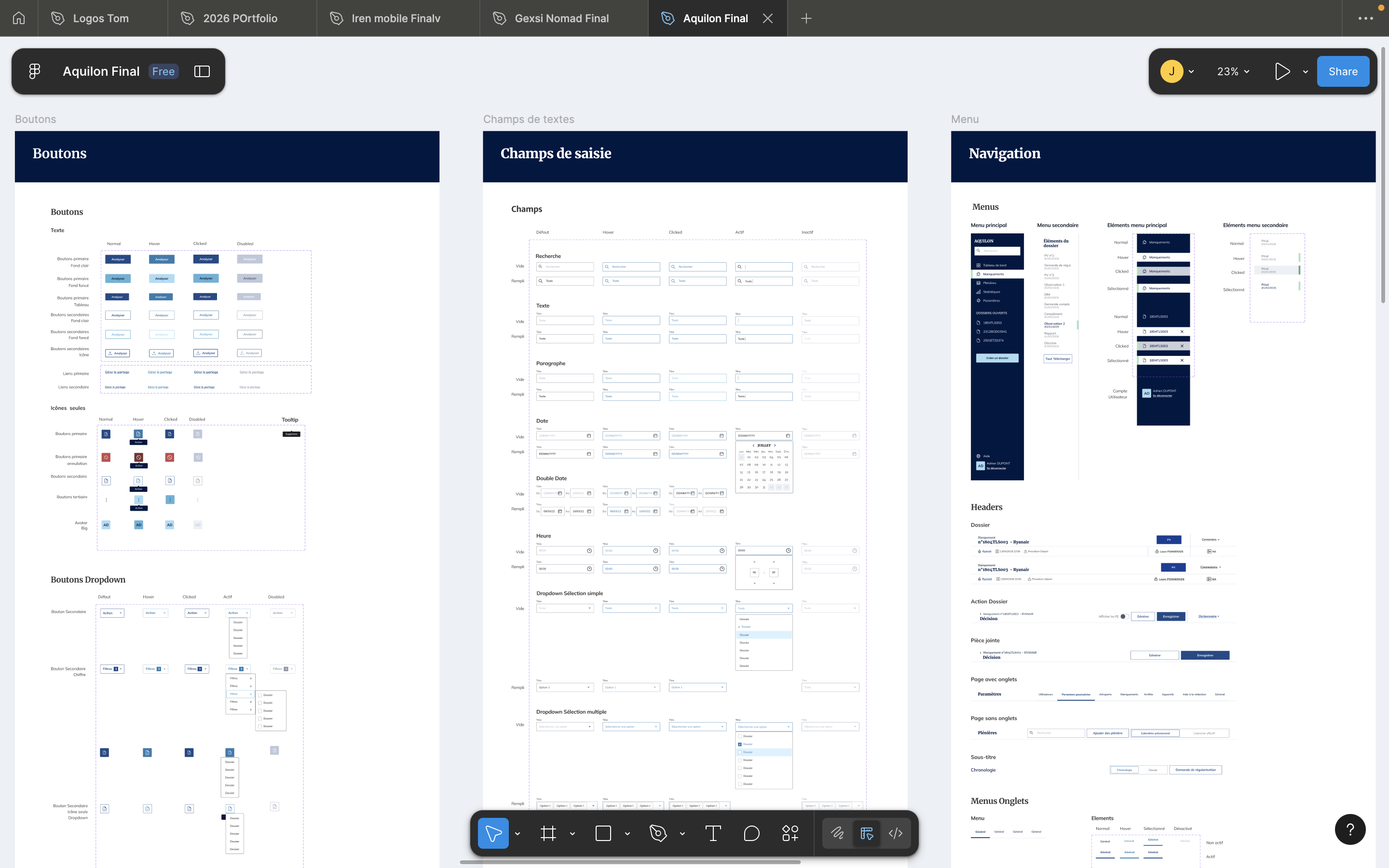
Given the limited timeline and my focus on creating an efficient workflow, I prioritized clear user flows and wireframes, worked closely with users through frequent exchanges, produced detailed mockups only for the main screen, and delivered a structured design system so the development team could build the remaining screens from wireframes.
This ensured that critical workflows were well thought through early, while allowing the product to scale consistently and efficiently during development.
What I did
From rigid structure to Dynamic case history
All cases use the same structure despite having different journeys
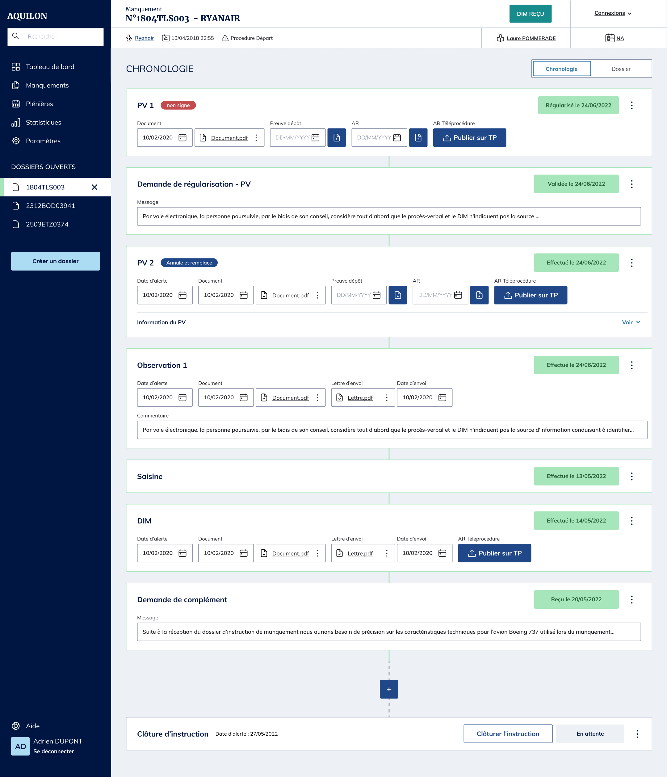
I replaced static forms with a dynamic case history that grows based on actions and events.
History built block by block
Cases build their history block by block as actions are taken
Automatic next steps and deadlines
Core process stages automatically reveal next steps and deadlines
Manual additions as cases evolve
Additional documents, communications, or materials can be added manually as the case evolves
From difficult handoffs to Clear visibility
Users can't quickly understand file history, making handoffs between teams difficult
Make a case's full history and next steps visible at a glance, so anyone taking over has context immediately
Timeline view for handovers
Created timeline views so users can quickly see past events and upcoming actions when taking over a case.
All files grouped by case
A 'File View' feature displays all files grouped under the same case, each with its extracted information and the rapporteur's summary used for the plenary session.
From tool-switching to Integrated workflow
Key workflow steps rely on external tools
Eliminated tool-switching by integrating key functions
Plenary scheduling
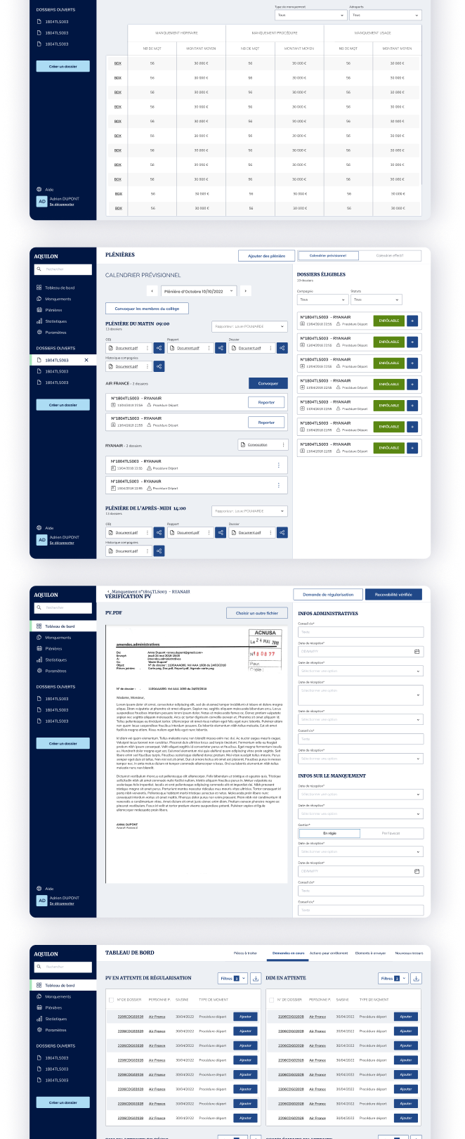
Previously managed outside the platform, provisional and confirmed schedules can now be set directly within it.
Request tracking
Reports, modification requests, and requests for additional elements are now automatically transmitted and stored in the case history, where before they lived outside the file entirely.
Custom statistics
Statistics that used to be compiled manually outside the platform can now be built in, with users selecting their own data parameters and timeframes.
From time-consuming work to Streamlined task
Many tasks were repetitive and nearly identical each time, taking up a lot of time.
Streamlined common actions and added document templates with pre-written sections for recurring reports.
Smart file upload
Users can enter all related data while previewing the file side by side
Document templates
Writing assistance with pre-written templates and paragraph sections for recurring reports
From unclear task priorities to Dashboard by actions
Users couldn't easily see what tasks they needed to do for their role
Create a dashboard structured around what each role needs to act on, not around raw case data
Tabs matched to user roles
Cases are organised by what needs to be done, with each tab matching specific user roles so users can immediately see their relevant tasks.
The impact I made
reduction in daily task completion time
user satisfaction score
team adoption within 2 weeks